Research into magazine conventions
- Oct 9, 2024
- 4 min read
Updated: Oct 31, 2024
Mind Map

I made a mind map summarising all the conventions and types of magazines to help me choose the genre of magazine I want to create and to ease my research process. The app used to make the mind map was Edrawsoft on Windows, the production process was easy and quick even though I had never made one on this app.
The research I wanted to do is focusing more on Music, Fashion and Photography in order to create inspiration, for achieving my future magazine idea. Therefore the magazines I chose were Vouge, Rolling Stone and Billboard because they meet my research criterias. As we all know Vouge is one of the most influential fashion magazines in the world. At the same time, Rolling Stone is at the same level as Vouge but for the music industry, well known for its longevity and popularity among the people (mostly Americans). Billboard is also a music-related magazine but is more inclined to a younger audience such as myself, another difference between those two is the genre of music they are covering the most as Rolling Stone is more rock focused and Billboard tends to be more Pop.
VOUGE

COVER
The cover page I chose to analyze has a picture of Rihanna as the main image, she makes direct eye contact which gives her a sense of empowerment. Rihanna is seen "walking" on the water making her seem divine with a bold outfit capturing the viewer's attention as the dress is something only a model would wear with its colourfulness and shiny expression.
Conventions typical for Vogue magazine can be found on this cover such as the Masthead which is strategically placed at the top of the page, big enough to be visible and recognizable, but also ensuring it doesn't cover the central image. In this case, its colour is not meant to distract the reader from the actual photo which can be seen but to direct them to it. The colour-coordination is meant to leave a mark behind and beautifully enhance the earthy tones.
The text “It's Rihanna's World” being the selling Tag/Line attracts the reader and creates a sense of interest in reading the magazine. Moreover, it has a clear dateline on the far right, written small, which helps the reader, as well as the publication, keep track of the issue, while the main cover line is meant to summarise what that issue focuses on, which in this case is "FROM MUSICIAN TO MOVIE STAR TO MOGUL, IS THERE ANYTHING SHE CAN'T DO?". The other cover lines which can be seen at the middle of the page between the masthead and the main one present some more in-depth articles or exciting information the magazine has to offer. The main image is also topped with the model credit bigger than the rest of the cover lines for the reader to see it.
CONTENTS PAGE

The title of the contents page is the title of the magazine and the month of the magazine issue, (Vogue December 2020) the title is big, classic and easy to see and read, however, they made it a pop of colour with a bright red colour. The colour red connotes danger, mystery, and action, differing completely from the colour palette of the central picture.
Near the picture is text in a simple font, and is separated and structured so it is clear for the audience to know what they are reading.
The different parts of the magazine have catchy names making it more appealing to the audience, then making them interested in reading it.
At the side of the page appears to be a section with credits which shows the audience who the models in this magazine are, who worked on the design, who took the photos, who edited the photos, etc.
2 PAGE SPREAD
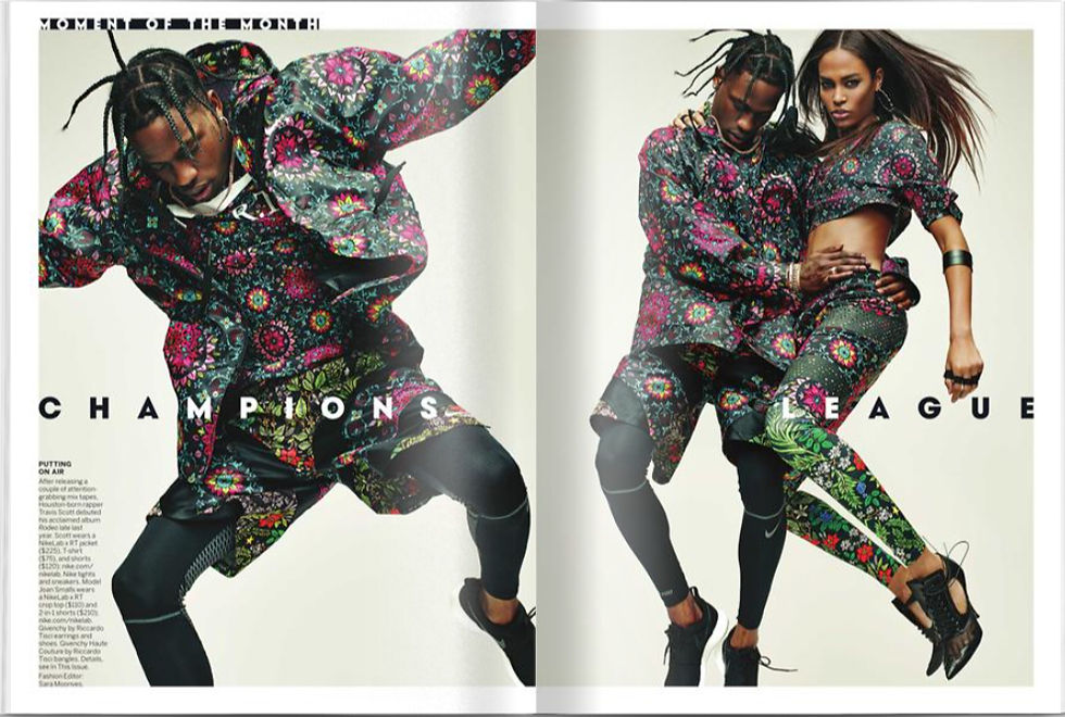
I chose to analyse this double spread because I feel like it emphasizes the meaning and simplicity as well as the artistic side of a magazine through the use of colours peculiar style of the photos and the short text.
The angles in which the photos are taken are especially different from what we have seen in the other magazines because a posh set up was not made up but an empty white background was used. Suggesting the idea of beauty in every piece of clothing this photoshoot really inspires me to do the same in our magazine and makes the reader look over the normal conventions used in magazines.
The white framing is meant to subtly enhance the pictures and the characters while giving a nice finishing touch to the entirety of the double spread, while the only text lines we can see are small.
The genre of this magazine is obviously artistic fashion, and its target audience are people who look beyond the normal characteristics of fashion as well as photography and who know how to appreciate a more unique take on the modern fashion industry. I believe anyone from women to men could read this magazine as it also focuses on the new trends.
I would definitely take into consideration the precise colour coordination needed when making my own photoshoot as well as how angles can change the look and genre of the specific photoshoot.


Comments