Masthead and article titles
- Oct 9, 2024
- 2 min read
Updated: Oct 24, 2024
what is the title its meaning and the fonts used in the Title and in each page

I decided to have a simple but meaningful title and logo which explains the feature articles of the magazine. The title Fashion Groove explains the two combined parts that the magazine explores. Fashion is featured across the magazine by styles of clothes. Music is also focused on by explaining the correlation of it with fashion at the same time music will be a main topic of the magazine in all the articles. Also, both topics will be discussed across the magazine in a more deeper endeavour. For example the history and future of those two arts. When it came time to look for fonts for the masthead I wanted it to be very minimalistic so that the impact of the titles on the content pages could stand out more and capture the essence of the page. The font I used is Times New Roman, as it is the most classic and well-known font. This was available in Photoshop because of its popularity.

The two logos I made are white and black so that they can be used in different circumstances for example when the background is white I can use the black logo to stand out in the text. In the logos Fashion is written more to the right than Groove this happened to make the text blend in more as S creates a nice curvature for G. The colour theme is minimalistic as well to create a sense of luxury and a premium brand. In fashion, this is important to attract viewers.
The logo will keep the same position on each cover made for the magazine. I got this idea from VOUGE magazine which uses the same principle at each of their magazines. This will create a brand image and recognition to attract future customers.
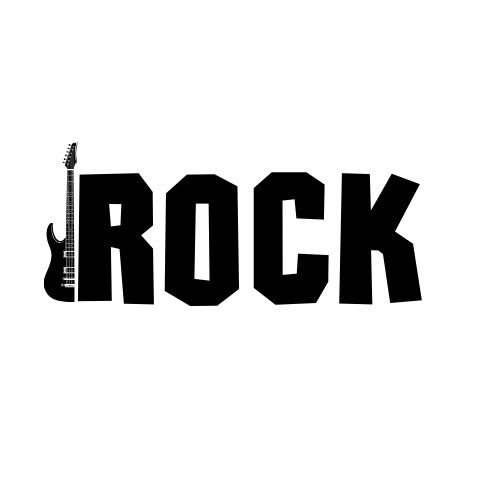
This font is used on the first feature page out of the 4. The name of the font is Rockstone I chose this one because as the name suggests it gives the feeling of a rock band. I found it on the site My Fonts and downloaded it onto Photoshop. The guitar next to the letter R was added afterwards to give it an extra edge. On each page, I chose either black or white to create contrast to pop up.

Another feature page discusses the country music genre. The title Country is in TS Country NP font and as the name suggests it gives an old western look to the text. I found this font on fontke as it was not available on Photoshop The hat was added as it is a symbol of this genre and I thought it would be a nice touch.

The Hip Hop page was more difficult than I thought because I couldn't find a matching font to the hip-hop style. I ended up using the Playlist Script as the font. This was found on befonts.

Last but not least the Classical theme needed an elegant looking font. This is achieved by using a highly calligraphic font to give the feeling of sophistication. The font used is ITC Edwardian Script found also on My Fonts.


Comments