Magazine brand identity
- Oct 9, 2024
- 2 min read
Updated: Oct 28, 2024
The main idea of the magazine is to highlight the influence music has on fashion and fashion on music. This is all achieved by the content and the elements used to showcase each genre. The rest of the magazine will also focus on other related topics like news, history and trends but the main vision will remain in the feature article.

For the cover page, I want to use a simple colour scheme, for it indicates a neutral look and creates a sense of mystery for the inside of the magazine. Black and white are known to symbolize elegance and simplicity.

For the first feature page, I want to use colours that remind me of rock music therefore I chose different variations of the colour red because many rock albums have red in them. Red is a colour of dynamism and energy which explains well the rock genre.

For the country inspired page, I will use colours found in the land of country music. Sand, leather and wood all have brown to yellow colour notes, therefore I chose the colour copper as it contrasts well with the red in the rock page and symbolizes Country style.
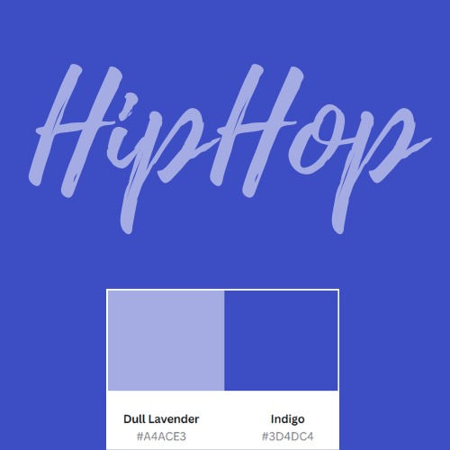
Hip hop is based on street culture which has a wide variety of colours. They express themself by doing graffiti with very vibrant and diverse colours. Therefore I chose a powerful mix of blue and purple to create the indigo colour which in my opinion represents well the hip hop culture as it symbolizes individualism and creativity.

The classical style needed to be represented by warm and welcoming colours that are seen in luxury and sophisticated attires. That's why I chose the base colour to be a off white (pearl bush) with the secondary colour as a truffle colour (tundora). This gives the page an elegant look.


Comments