Social Media page ( making of plus final ) - Minor Task
- Apr 9, 2025
- 7 min read
Updated: Apr 16, 2025
Brand
We realized that the first thing we need to achieve with this project is a unique brand identity that can allow us to promote ourselves and attract consumers. To do that, we started by figuring out the name and logo of the documentary. We thought of what the project represents and the following words came to our minds: East, Europe, Art, Inspiration, Struggles, Discrimination, and a few others. Then we brainstormed for a few days, but with no luck. We decided to ask AI using Chat GPT for some name Ideas. We did that by telling him what our project is about, and he started giving suggestions. None of which attracted us. His suggestions had a sentence below them explaining the suggestion, and in one of the sentences I saw with the "corner of my eye" the word lens. And one of the suggestions was the eastern view.
Something snapped in my mind, and I immediately said "The Eastern Lens". Rianna said that she likes it a lot and she noted it down in the notes app on her iPad. I came up with this name because a "Lens" symbolizes something you look through, and "the eastern" represents Eastern Europe. So the world seen from an Eastern European point of view. We searched for more in case we found something better, but with no luck. We have already gotten used to The Eastern Lens, therefore it remains so.
We got hit with an idea of a logo and concept that visually illustrates the name by having a glass frame and inside it, Eastern Europe. We tried different ways of making this concept a reality, but none of them looked pleasing. They were way too complicated and charged. We needed something simpler and more minimal, like other researched brands had.


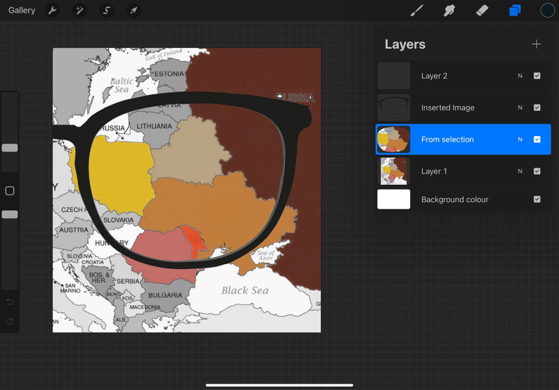
Suddenly, Rianna had a very unique and nice idea of using the type of text that she made for her mood board in our Logo. She used a brush called Thylacine on Pro Create and writes by hand each word. She made a few drafts, and we ended up with a unique and original logo.


The color of the text matches the color palette that we chose for the project, and it's Rianna's favorite color. I had the Idea of putting 2 circles that represent lenses in the background to create a kind of Glass through which you look abstractly. This way we can also use the circle in other scenarios as a "signature". For example, by making it a Watermark of a profile picture.
FINAL LOGO


We decided to make this unique writing style part of our brand identity, and this type of text should be recognized across all The Eastern Lens products. We also rendered it with a white background to be able to fit all scenarios of needs.
Making Of
The first thing we did to start making a Social media page was to create an email address for the brand.. This could be later used in other projects as well, but it will be especially useful when creating social media pages, as a registration process is necessary, which requires an email. We thought of using our emails to make the account, but it would have been hard to share the account as we would have required each other's passwords. The process wasn't too complicated, as Google has a fast and easy way of creating an email. The email ended up being rm.media.documentary@gmail.com because I did it before the name was chosen.
After sharing the email and password with Rianna and setting things up, I went straight into Instagram and made a brand new account using this email.
We started making the Instagram page by going back to the research that we had done in the past to get inspiration. Looking at "The Price of Everything" Instagram page, we saw that they highlighted all the people being interviewed across the documentary by posting a picture of them during the interview together with a small description of them and the brand logo under them. To meet conventions, we wanted to do the same thing. Therefore, I started to take the SD cards with the interviews on them and look through the footage so that I could make a screenshot of both Oana and Ovidiu being interviewed.
I took the screenshots and sent them to Rianna. We met again a few days later to discuss the future of the page, and we had an idea of how we could create engagement and be creative. As one of the conventions is to show the release date and place of the documentary, we wanted to do it engagingly. The first and third posts would be the screenshots from the interview together with a big logo without the circles, and the middle one would be a streaming service like Netflix, which would be released with a coming soon statement. The common ground of these three posts would be the large numbers they all share.
The original scheme

These three numbers would together reveal to the viewer the release date of the documentary ( 19.09.25 ). Rianna began working on making the posts but quickly realised that the text wasn't readable. Therefore, we made the decision to make these three posts black and white except for the texts themselves, which are the original reddish colour. Another idea struck me of creating interest by blurring the images in the background ( of the interviews), creating a sense of mystery. We've done multiple drafts and gone back and forth on different problems, but we managed to go through them all. After these three posts were done, we wanted to add a description to each of them. We did not want to copy "The Price of Everything" too much by doing the same biography-type description. Therefore, we settled for no caption to remain mysterious.


These are the first three final posts made in an Instagram-friendly format, which we are going to upload on the Instagram page @theeasternlens. I am really glad that it turned out this good.

Next, I added the profile picture, which was initially the black logo but later changed to the white version as it looked cleaner. We decided to post a story and make a Highlight that would keep that story on the account forever. The story would include a paragraph of questions or something that would intrigue a possible viewer to watch the documentary.
We ended up making a story that would attract teenagers. This is also based on the target audience research, as it shows that younger audiences tend to use Instagram more than older ones. The highlight initially had a blank, brownish colour picture in it, but I
The highlight initially had a blank, brownish colour picture in it, but I

remembered that we have a perfect Circle that would fit that space perfectly, adding to the personality of the page. The last thing we needed to do was to fill the feed up with at least 1 or 2 posts. The problem was that we didn't have any special content or previous content made, which we could reference; therefore, we decided to look for inspiration. We ended up arriving at the social dilemma's Instagram page when we saw that they have over 100 posts that all promote the issue of the documentary, even though they didn't produce or organize the content. Meaning that they have posted announcements, meeting dates, and other content that raise awareness on the social media problem, even though it's made by other people or organizations. That instantly clicked for us as it would be a perfect fit for a page that doesn't have any original content to post. The problem was that these meetings and organizations were really hard to find to match our cause. This created a panic between us, and we decided to take matters into our own hands by creating fake organizations using AI and ProCreate.


We made a fake identity and a poster for two posts and went ahead and uploaded them to Instagram. Hashtags were also added to attract audiences interested in the topics mentioned in the tags. The descriptions contain motivational quotes and formal explanations of certain communities and future meetings. The Titles "SUPPORTING EASTERN EUROPEAN ARTISTS" and "THE LACK OF INSPIRATION" attract the right customer base for the documentary. It also raises awareness of these topics to anyone engaging with the page itself. We also decided to add a reel made with AI that also addresses the topic of difficulties met by artists. The title is THE RAW TRUTH OF CREATIVITY, and it promotes an organization that hosts an event in Bucharest on the 8th of May. The video was pretty easy to make, and the text was added on Canva.
What did I use
The apps used were ProCreate, Canva, Chat GPT, Gmail, and Instagram. ProCreate was used for creating the initial brand ( logos ) and the first 3 posts. Canva for editing the video to create the reel. Chat GPT for their AI image generating tool that they recently introduced, which was used to create the 4th and 5th posts. Gmail created the email account for the project, and Instagram was the chosen social media page. As I said before, we also imagine the trailer of the documentary being on YouTube and having a Facebook page similar to the one on Instagram, to reach a wider audience
Feedback
I started sharing the Instagram page with my friends to receive feedback. I asked them if it looked professional and if they would be interested in viewing something like this. They all said kind of the same things, as in it is creative and it looks amazing, but it does not necessarily engage with them, as they do not have an interest in pursuing art majors or anything to do with that. They liked the idea of the release date, but they told me that they wouldn't think of it if I didn't tell them what it symbolizes. The teacher also had only positive feedback to give me, except for the fact that it isn't recognizable the release date. To combat this, I will introduce a biography that will give a bigger hint so that anyone can figure out the meaning behind those numbers.
Final


Comments