Rough Cut ( sound text subtitles ) + Feedback - Major Task
- Apr 9, 2025
- 8 min read
Updated: Apr 25, 2025
The Process
I started making the final documentary by adjusting the colour grading and sound of all the footage. I have done this by watching a few YouTube and TikTok tutorials on how to achieve a good enough colour grade, as it was a first-time experience for me. Here are three examples which I found the most useful
And a quick 3-step tutorial on TikTok by Will Byrne
After I started to understand how colour grading works, I went straight into it by editing a part of Oana's Footage and playing with the settings called Lumetri Color till it looked aesthetically pleasing. Then I tried copying and pasting the settings over all the footage; this has proven to be unsuccessful because of different periods of filming, which affected the amount of sunlight that entered the room. I tried going over the footage and changing the ones that I found to be very different from one and the other. I used the advice of looking at the numbers 10 and 80 in the Lumetri scale and trying to fit the colours Red, Green, and Blue between those scales as much as possible.

Before entering Sound, I was aware of an existing Premiere Pro feature called Audio Enhance, which enhances audio quality by reducing disturbances and background noise. I tested this feature on one of the footages, and it worked surprisingly well. I decided to incorporate it in all the footage. Still, again, I dealt with the same problem as I did for the colour grading because Oana's interview was cut in half using the additional microphone for the first half. Then the iPhone in the second one, which has a completely different sound quality and Ovidiu's interview was filmed in a different setting, which again caused different sound quality. I divided the audio intro into three presets for each setting and enhanced them in their sequence.
I also added Non-diegetic music in the background to build an atmosphere in the documentary. I wanted something dramatic that creates an awareness effect on the viewer. Like I heard in the documentary "Abstract The Art Of Design", which I have researched for the major task, to achieve this, first, I needed to find a music source that is also downloadable. I came across a site called Epidemics Sound, which featured great music that was all non-copyrighted for all kinds of genres. I then searched for documentaries and found a song called "Hox" by Lennon Hulton, which matched what I was looking for. However, to download it, you needed to make a one-month subscription, which costs 12.50 euros. I had luck with a free trial option of 1 week, which I used, and after downloading the song, I cancelled it immediately. I imported the song into Premiere Pro and pasted it over the second layer of sound. After fitting the intro part, which perfectly complemented the visual part by being a bit slower and more introductory, I added some sound effects, which made the music quieter when the interviewee was speaking. Then again louder and then more tranquil for the rest of the documentary. This added a more professional feel as the first 20 seconds felt like an actual introduction. Then I realised another problem: on the second music layer, Oana's phone-recorded footage was pasted, and I overlapped it with the music, which automatically deleted that part. I realised this only after completing all the edits and transitions, which has cancelled the option to revert by pressing Ctrl + Z. This added 2 hours to the edit process as I needed to do the cuts and paste the audio again, which was even harder because I only had her mouth to sync as I deleted the original audio of the footage.

After this, I delved straight into making the Intro and Fonts. I knew exactly what to do for the intro because of the storyboard I made for it. The harder part was making it. And for the fonts, I was unsure, but I was confident that I would figure something out.
I have discussed the importance of text in any media piece, but in a documentary, it's a crucial element. From the title to the credits and the information displayed on the screen, everything has to be in harmony.
I started by looking for ways to achieve my Intro vision of the see-through logo into which the camera goes. The introduction to the documentary is a crucial piece that I was looking forward to perfecting for the viewer.
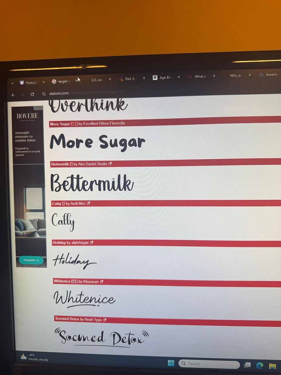
Initially, I was searching for fonts that matched the original logo of The Eastern Lens. After searching in Premiere Pro's font library without finding any suitable results, I turned to Google to find online, downloadable fonts. No luck there, either. Then I asked Rianna to handwrite the logo in ProCreate. By doing this, I will maintain the same style and brand identity as in the minor tasks. I realised that she needed to use a fuller brush than she originally did.

I wanted this so the viewer can see the text during the transition into the documentary, as the original brush was not filled and had linear gaps in the letters. After I received the new logo from Rianna, I started by importing it from WhatsApp ( our method of transferring files fast and of high quality ) to Photoshop, where I used my past knowledge from the As magazine task and cut the text from the black background, leaving me with only the text without any backgrounds. Then I realised that I needed to do the exact opposite, as I needed the text itself to be empty for the video to play inside it. To do that, it was a bit more complicated, but after conducting a brief search on Google, I managed to find what I needed to do for the cutout to take place. I took the Picture and exported it in Premiere Pro. After that, I first added the background video by using some footage from Oana's studio. The footage was long, but I found a 20-second part that looked good and had the setting of the interview visualised. I then pasted the Cutout picture on a layer above the video and pressed play to see how it looked. It was perfect and exactly how I envisioned it in the first place.

I then added a normal transition at the end of the 20s initial intro, which was called cross zoom. I liked it, but it was too straight and didn't look as professional as I wanted it to. To fix this, I went to YouTube and started searching for tutorials.
I found a YouTube video that was very useful: https://www.youtube.com/watch?v=Hf-zHkDBAOM. It opened a new world to me of those transitions and movements of FX effects. It took me more than 1 hour to fully understand and implement this in my intro, but in my opinion, it was worth it. After an opening transition effect, I finally had a 15s intro, which at the last 3 seconds started to move into the viewer.
Going into Fonts, I again knew that these apps don't have what I am looking for in terms of looks. Firstly, I wanted to know where I needed fonts. After some thinking, I realised that there are only two places where text would be seen, except for the intro. Those are the transitions between topics ( so difficulties, inspiration, and community ) and subtitles. When it comes to the transitions, because there are only three words that need to be displayed, I thought of doing the same procedure as I did in the intro, as in asking Rianna to hand write the three words and then to cut out the text from the image and paste it in on the documentary.

The whole process was easy. Mostly what I did at the intro, but this time I've cut the text out from the image and pasted it onto the project. Upon doing this, I encountered a problem when pasting the text onto the project, where a grey filter appeared as a banner in the background of the text. It is faded and see-through. This happened because Rianna sent me the pictures with the text being white, but the background grey. Because we weren't together, we couldn't discuss this rapidly, and she sent all three words like this. Then, when I tried to cut the text from the background, I used the colour picker method,

which I assume didn't correctly cut the background, leading to this banner effect. After seeing this, I thought it added depth and liked how it looked. Therefore, I decided to leave it as is without any further edits. I left the animation for about 5 seconds at each topic and added a fade effect in and out of the text to create a smooth implementation of the effect.
The Subtitles where not so hard to make but more time consuimg as I had 5 minutes of dialoug to translate and write. I used what I learned by doing the preliminary task
by searching a site that allows translation from Romanian into English from recordings.
After I found a site called Sonix.Ai, I created a new sequence on Premiere Pro where I pasted only the audio from the whole documentary ( without the Non-Diegetic music ), which allowed me to download only those files easily. After that, I pasted the audio onto the site, and it took 3 minutes for the site to give me the Subtitles already transcribed in English. This was perfect, and it really eased my work.


However, the translation wasn't good at all. This led me to rewrite and correct the text for the documentary again manually. After this 60-minute-long process, I pasted the subtitles in place and left them with a simple, minimalistic, professional-looking Font. This is done in all major production documentaries and movies, as subtitles should be optional for multiple languages.

I specifically added a part where I would make an Animation to illustrate what Oana is talking about. It was when she was discussing inspiration and how she created collages by combining different copying and pasting mechanisms. I wanted to create an animation that would visually illustrate this process for the viewer, as it can foster a deeper connection and inspire artists who watch the documentary. To achieve this, I consulted Rianna, and she came up with an idea where she would screen record the ProCreate app as she manually dragged certain stickers in and out of the screen to create an animation. Then speed up the whole thing artificially and cut it as we wanted. Rianna focused more on producing the animation, but she also really cared for my feedback. And after two or three drafts, she created a nice animation split into two parts that matched what she was explaining in the interview. After she sent the video to me, I imported it into Premiere Pro and pressed the fill option to occupy the entire screen. Then I realised that Rianna had screen recorded the animation, meaning it was filmed in an iPad format, which, when played full screen, destroys the video quality. Therefore, I came up with a solution by making the video itself smaller and placing it next to Oana, who explains what is happening in the video. After I saw how it looked, I realised that it should have been like this from the start, as it looked amazing. Then I added a cross transition that makes the animation pop up smoothly in the screen. I said that animation to both sequences, and I completed that part.
I mostly did straight cuts in the whole documentary and didn't add any special effects except for overlaps of visual footage with audio from the next scene, which in my opinion added to the professionalism of the documentary.
Feedback
For feedback, I asked my family, friends, and teachers to provide honest opinions on the documentary. I knew that they would be biased in their responses, but I would still find a lot of good feedback in their answers. Their negative feedback consists of:
No Audio transitions
Poor colour grading and out-of-focus main camera footage of Ovidiu
Ugly Sub-heading Graphics ( delete the background )
No place names
Grammar mistakes in the subtitles
Write the interviewees' names
Write the episode number and name
Write who the documentary is directed by
Overall, they all found our work amazing, and they were truly surprised by the level of professionalism in the documentary and the fact that we were able to achieve this in such a short amount of time. I found all this feedback very useful, and I will try to correct everything in the next and Final version of the documentary.
1st Draft of the Documentary


Comments